So now that I finally finished "Once Gods" and have it sitting in the review process over at Comixology, I find myself looking back at the experience of it all. I feel as if I didn't trust myself enough with my work, or my whole approach. I feel as if I forced myself to work a certain way, do certain things because that's what I *thought* was the most acceptable thing.
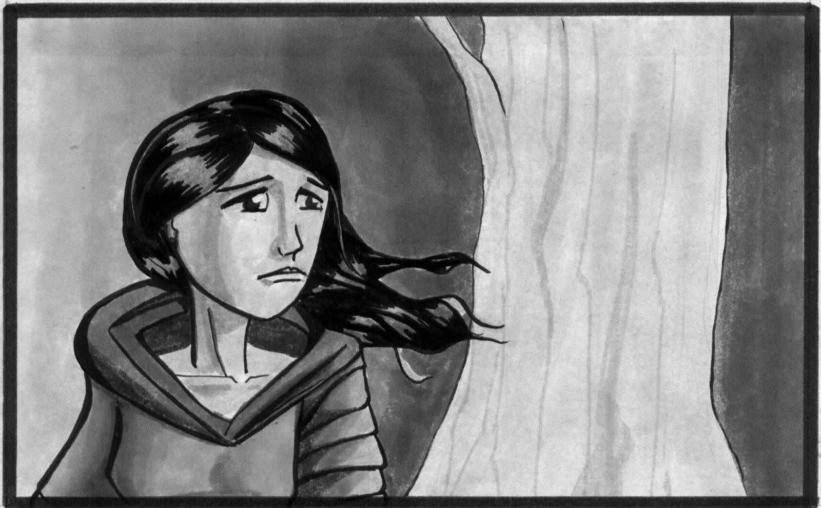
Now that it's done, I feel as if I did myself an injustice. Now I want to create something my way. Without looking for the most acceptance or approval. Nothing provocative, mind you - just a different approach. My drawing style, as an example, is one of those things. My hope is that I can stay true to that with my new project. This piece is an exploration into that style and process that I like.